
This week, it’s a look at the Honorable Mentions — charts that may have also been useful, helpful, and interesting, but didn’t quite make it into those other sections… but really an excuse to dive into yet another set of charts! Charts
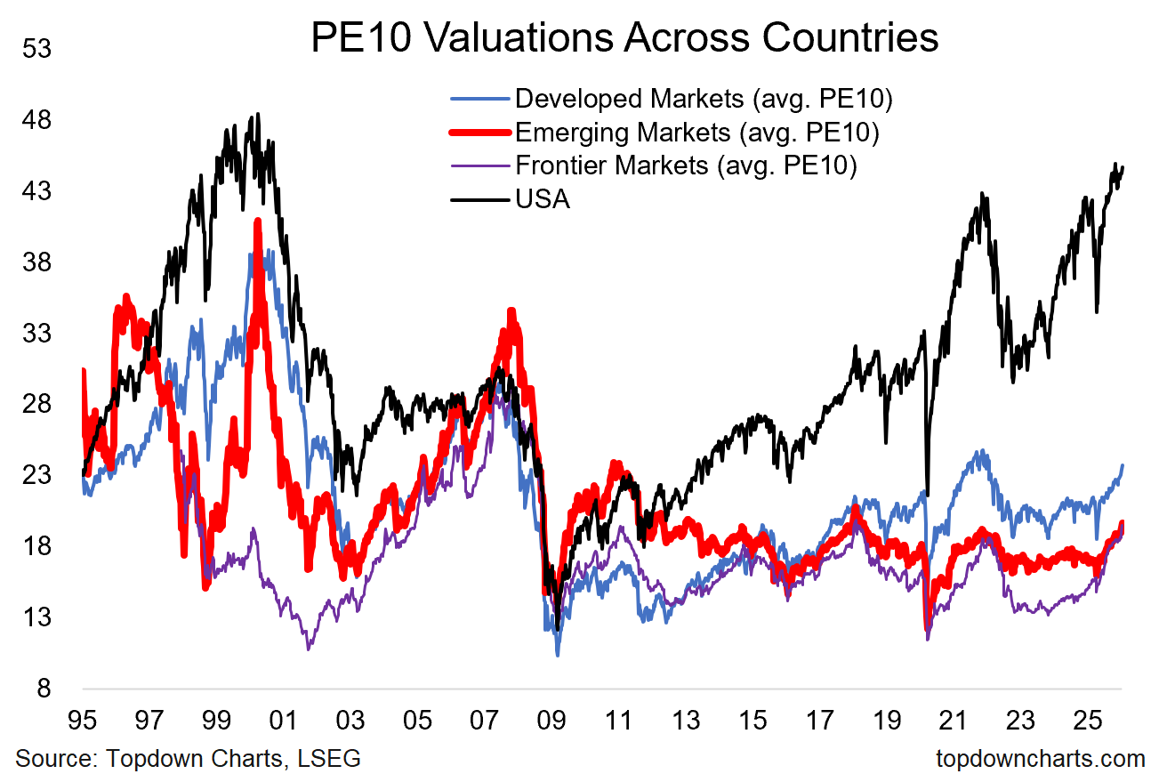
1. Clues of catch-up
This chart shows how far the US has diverged from global equity valuations, but also the nascent catch-up trade clearly underway.
2. Peak performance
This one shows US stock market outperformance peaking vs DM and EM. All good trends come to an end, and all good cycles do what cycles do.
3. Stocks vs Bonds over the Long Run
The rolling 10-year total return premium for stocks over and above that of bonds looks stretched vs long-term average, and it looks late in the cycle (and it does look cyclical).
4. The big reset in Commercial Real Estate
In real inflation-adjusted terms, the CRE downturn has been substantial (-30%) and drawn-out (almost 4 years since peak to initial trough). Some might say that’s “enough” (…downturn done?).
5. Tech capex crowd-out
Successive waves of capex by tech and tech-related stocks have seen a crowding-out of capex vs the rest of the .
6. Surging semiconductors
The big beneficiary of the latest wave of capex and indeed of the AI hype bubble has been semiconductor stocks – with that sector’s market cap weight far eclipsing levels seen during the dot com boom. Is it the new normal, or just another cycle of boom and b…?

5 Stocks Our Experts Predict Could Double In the Next Year
By submitting your email, you'll also get a free pivot & flow membership. A free daily market overview. You can unsubscribe at any time.